15 Common CSS bugs and their easy fixes
Although the tradition of creating a logical and structured layout using CSS has received innumerous appreciations from web developers across the globe, there have been multiple pitfalls associated with the same. Even with the quick availability of handy tips and tricks on creating a CSS layout, some or the other kind of bugs/errors tend to enter into the code. In this post, I’ve jotted down a list of 15 common bugs encountered during creation of a CSS layout. So, let’s take a closer look at each of these bugs and get to know about their simple-to-follow fixes.1. The Staircase Effect
Conventionally, every web developer uses a set of lists for generating the navigation wherein he created the container element, some links and floats the anchors in the desired direction. The code snippets associated with the same are displayed below:CSS
12345
<ul>
<li><a href="#"></a></li>
<li><a href="#"></a></li>
<li><a href="#"></a></li>
</ul>
CSS
1234567891011121314
ul {
    list-style: none;
}
ul li a {
    display: block;
    width: 120px;
    height: 20px;
    text-align: center;
    color: #fff;
    float: left;
    background: #95CFEF;
    border: solid 1px #36F;
    margin: 20px 4px;
} The IE(Internet Explorer) will render the effect as below:
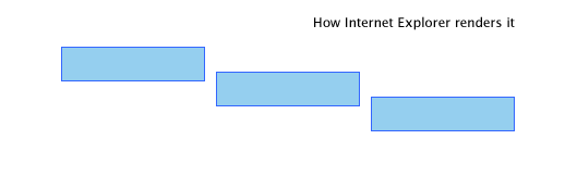 Well, a simple fix for this bug is to float the li elements instead of the conventional anchor elements. For this, you just need to add this code snippet:
CSS
123
ul li {
       float: left;
}
2. IE Double Margin Float Bug
As an Internet Explorer-exclusive bug, IE Double Margin Float is a situation wherein a particular element which is being floated and rendered a margin in the same direction as of the float ends up with having a margin size that is twice the original margin size. A simple fix for this bug is applying a display: inline rule to the floated element. So, you need to replace the below code:CSS
123456
#container {
    float: left;
    width: 300px;
    padding: 12px 17px;
    margin-left: 20px;
}CSS
1234567
#container  {
    float: left;
    width: 300px;
    padding: 12px 17px;
    margin-left: 20px;
    display:inline;
}
3. Auto Overflow and relatively Positioned Items
This is a bug which crops in when within the layout, you set the parent container’s overflow property to “auto” in addition to placing a relatively positioned item within it. This relatively positioned item tends to violate the parent element’s boundaries and overflows. The code associated with the same is shown below:
CSS
123456789101112131415
#inner-container{
    background: #95CFEF;
    border: solid 1px #36F;
    width: 200px;
    height: 140px;
    margin: 20px 0;
    overflow: auto;
}
#another-inner-container{
    background: #555;
    width: 130px;
    height: 155px;
    position: relative;
    margin: 20px;
}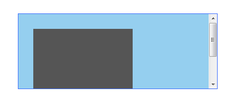 But, the output rendered on Internet Explorer is:
The simplest fix to this bug is to position the parent container relatively as shown in the below code snippet:
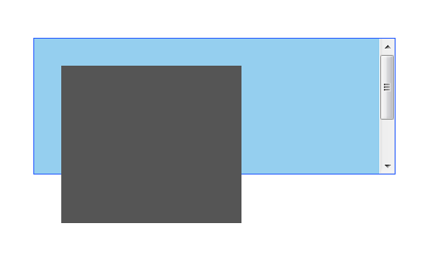
CSS
123456789
#inner-container{
    background: #95CFEF;
    border: solid 1px #36F;
    width: 200px;
    height: 140px;
    margin: 20px 0;
    overflow: auto;
        position: relative;
}
4. Internet Explorer ignores the min-height property
Although it is imperative to set a minimum height to an element for converting a design into a pixel-perfect design, IE ignores the min-height property and instead fetches the value for height which has been declared as the minimum height. A simple fix to this issue has been created by Duston Diaz. Here, you just need to include the below code snippet:CSS
12345
#inner-container {
  min-height:140px;
  height:auto !important;
  height:140px;
}
5. Flickering background images
On using CSS sprites as the background images for links/buttons, you can notice that these images tend to flicker in the Internet Explorer 6. The reason being that IE6 can’t cache the background images properly and has to reload it again and again. This bug can be fixed by using a single line of Javascript which forces IE6 to cache the image. Here’s the Javascript code:
document.execCommand("BackgroundImageCache",false,true);
6. The IE6 Box Model Bug
If the quirks mode has been triggered in IE6, the browser will use Microsoft’s traditional interpretation of box model, excluding borders and padding existing in total width of element. An easy remedy to this bug is to use a correct doctype. Also, you can eliminate this bug by avoiding the application of width property to a particular element which has the border or passing properties already applied to it.7. Unwanted space between list items
IE6 adds unwanted vertical spacing between list items. The code used for including spaces between list items is:HTML
12345
<ul>
 <li><a href="#">Link 1</a></li>
 <li><a href="#">Link 2</a></li>
 <li><a href="#">Link 3</a></li>
</ul>
CSS
123456789
ul {
    margin:0;
    padding:0;
    list-style:none;
}
li a {
    background: #95CFEF;
    display: block;
} It looks like this:
 A quick method to resolve this bug is to add display: inline to the enclosing li element as shown in below code snippet:
CSS
123
li {
    display: inline;
}
8. A misbehaving Floated Layout
IE6 Handling the concept of floating elements using an aplomb where sometimes it tends to fumble. Here’s the code for the same:HTML
1234
<div id="container">
    <div id="inner-container">http://net.tutsplus.com/</div>
    <div id="another-inner-container"></div>
</div>
CSS
1234567891011121314151617
#inner-container, #another-inner-container{
    background: #95CFEF;
    border: solid 1px #36F;
    width: 150px;
    height: 200px;
    margin: 20px;
    padding: 10px;
    float: left;
}
#container{
    background: #C2DFEF;
    border: solid 1px #36F;
    width: 275px;
    margin: 20px;
    padding: 4px;
    overflow: auto;
}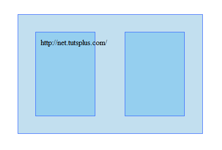 The output rendered in Internet Explorer is:
 An efficient way to prevent any such layout distortion is to apply overflow: hidden to the chosen element. The code associated with the same is displayed below:
CSS
12345678
#inner-container{
    background: #C2DFEF;
    border: solid 1px #36F;
    width: 275px;
    margin: 20px;
    padding: 5px;
    overflow: hidden;
}
9. Float Drop bug
Yet another IE6 exclusive bug, Float Drop is a scenario where the contains of a particular floated container exceed the width that has been specified for the container. Therefore, the other elements which have been floated adjacent to this container will drop below it. A possibly reasonable solution for this bug is to yse overflow: hidden or overflow: scroll.10. The Guillotine Bug
This bug simply truncates the content available in a particular floated/non-cleared element which is larger as compared to its container element each time the links with non-floated content are being moused over. A simple fix for this bug is to add a new element towards the bottom of the container, followed by setting the element to clear: both.11. The z-index property error
On using the z-index property for positioned elements in Internet Explorer 6 or 7, the stacking index will be automatically reset to zero, leading to rendering error. A viable solution for this is to add a higher z-index to the parent element.12. A missing hover state in IE6
The hover state of every element doesn’t support IE6. This adversely affects the usage of mouseover effects. An easy approach to get rid of this problem is to use the hover property for conveying mission-critical functionality.13. IE Resize bug
As per this bug, the page where a particular body element is centered and the layout has been fixed, the relatively positioned elements included within the same will probably become fixed if the page has been resized but not refreshed. A simple solution to this bug is to add position:relative to the body.14. The text doesn’t capitalize each type you type in Caps
CSS stylesheets comprise of a unique declaration which forces the title to display in lower cases. Therefore, a possible remedy for this bug is to look out for selector which controls the title. This selector will include the following:
text-transform: lowercase;
Just go ahead with removing or replacing the above with this:
text-transform: none;
15. The Whitespace/Vertical Spacing Bug
While creating a vertical list containing <li> elements along with block-level children, IE6 will add a certain vertical spacing between the list items. A simple solution to fix this bug is to put a spacing between the last character of text in the closing tag and block-level child as shown in below code snippet:HTML
12345
<ul>
    <li><a href="#">Item 1 </a></li>
    <li><a href="#">Item 2 </a></li>
    <li><a href="#">Item 3 </a></li>
    </ul>